Paragraph
The paragraph block is very like a paragraph in your word processor. Just type into a paragraph and the text will wrap at the end onto the next line. Press enter to move to the next paragraph, or Shift-enter to make a new line in the same paragraph (when typing a verse for example).
The default gap between paragraphs is set (fixed) by the theme, but Gutenberg allows you to set
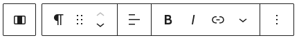
The Paragraph menu bar has icons to
* Align the text (left, centre or right);
* make selected text bold or italic.
* create a link
* open a sub menu with more actions
The left most icon, in its own box, allow you to select the 'containing' block - usually a column or group/stack/row.
You can use familiar keyboard shortcuts to make selected text bold (ctrl/b), italic (ctrl/i), or underlined (ctrl/u). On a Mac use cmd/command instead of ctrl. Press Shift+Alt+H to see all available shortcuts.
﹀ 'more actions' sub-menu

Highlight allows you to set the text colour and/or background colour of the selected text within the paragraph.
Inline code and Keyboard input wrap the text in <code> or <kbd> html tags. These are displayed in a mono-space font thus: This is code and This is keyboard.
Inline image allows you to insert an image as a character. This of course throws the line spacing out unless the image is very small, but it is useful in these help pages to explain the editor controls.
The rest as self explanatory.
Heading
Heading is much like a paragraph, but more prominent. It wraps the whole block in <H1> through <H6> html tags.
H1 is used for the content title. You should not use this in Gutenberg. Stick to H2 through H6.
When you see type / to choose a block you can use this keyboard shortcut: type a number of hash (#) symbols followed by a space to choose a heading: # for h1, ## for h2, ### for h3 and so on.
You should use a heading rather then just making a paragraph bold and / or adding text colour.
How Headings look is set by the theme giving a consistent look throughout the site:
Heading 1
Heading 2
Heading 3
Heading 4
Heading 5
Heading 1
List
List lets you make ordered and unordered lists.
The toolbar is like the Paragraph toolbar but with four extra icons to: select ordered list (numbered), unordered list (bullets), indent a list item, un-indent a list item.
The List items are held within a List container.
Both the List container and the individual list items can have their Font size and line height set under Typography in the Settings panel. It is better to set this at the container level as this applies to all the list items ensuring continuity.
A sample list
- unordered list item 1
- unordered list item 2
- unordered list item 2.1
- unordered list item 2.1.1
- unordered list item 2.1
- unordered list item 3
- ordered list item 1
- ordered list item 2
Columns
Columns provide the way to place content side by side within the webpage.
When you create a columns block a wizard pops up offering a selection of one, two or three column layouts of varying widths.
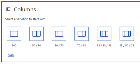
You can have up to a 6 column layout, but three or four is probably the most you will need.
Remember that the Bootstrap theme we use has a maximum body width of 1214px making a column in a 4 column layout have just 303px - quite narrow.
Also Columns are responsive, which means that on smaller screens they 'fold'. On a tablet the third column will probably fold below cols 1 and 2. On a Phone they will all be presented vertically in one column - so you should avoid phrases such as 'the image on the right' as it may appear on some screens not on the right!
Columns are 'containers':
The columns block contains one or more column blocks.
You can see the layout using the List View icon on the Gutenberg toolbar, and there easily select specific blocks to modify (e.g. add background colour)

Each column block contains whatever content blocks are placed therein.
In the settings panel, each column can have a border added and padding (space inside a border) set - as with this column.
Separator
Separator places a horizontal line in the page, spanning the width of the container which it is in.
In the settings panel you can change the colour of the spacer line, and the top and bottom margin.
Default:
Wide:
Dots:
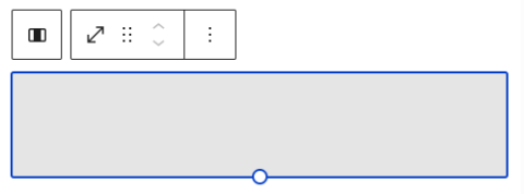
Spacer
The Spacer simply adds blank vertical space.
Unlike in a word-processor, you can not just add empty Lines or Paragraphs as browsers will remove repeated white space. (Actually, you should not add white space this way in a word-processor - there are much better ways of doing it!)
The spacer defaults to 100px in height. You can adjust this by dragging the 'handle' at the bottom middle, or setting the 'Height in pixels' in the Settings panel.
Image
The Image block is probably the most complicated Gutenberg block because it dovetails with Drupal's 'Media Library' and 'Image Styles' system, so it deserves a Help Page of it own (the next page!)